Doctors believe what they see.The training they get and the laws they must follow all reinforce that. If they see it themselves, then it’s real; if they only hear about it, it’s hearsay, which is much less believable.
This is why it’s hard for us, as chronic pain patients with all sorts of hidden issues, not to come off as shrill and demanding: we expect them to believe what we say, and they find that outstandingly hard. It goes against everything they really know.
Therefore, show them. Put it in pictures, put it in print, and watch their expressions change before your very eyes.

This is the first in a series of posts about the documentation that I’ve used over the years. I’m starting with the time I got tired of pointing to my arm and saying, “Well, it was like this (gestures) last week and it’s like this (different gestures) most of the time this week. It’s only blue because of the cold.” And then he couldn’t remember what I said it looked like a week ago.
No help at all.
So I went home, put my hand and forearm on a piece of paper, and drew an outline around it. I came up with a set of symbols to show what I needed to track, and marked up the outline accordingly.
As my situation changed from week to week and month to month, I grabbed paper, put my arm on it, drew another outline (I really should have made blank copies), and filled it in with the current state of my arm.
Lo and behold, I hardly had to say a thing. One doctor looked over my stack of images and said, “Wow. They really tell the whole story, don’t they? I hardly need to look at the medical record.” He did anyway, but was pretty quick.
My office visits were a lot more productive after I started keeping those pictures. I called them “snapshots” and collected quite a few of them before the case became too complex and moved into different territory. (More on that later.)
Here’s the key I came up with to explain the symbols I used for the symptoms I had at the time:
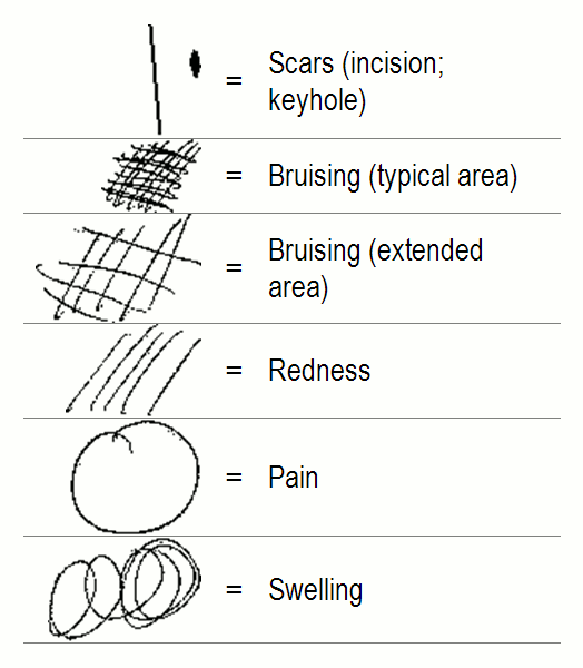
As you can see, I just scribbled patterns which I found easy to remember. Nothing fancy.
Each sign is distinct from the others, except for the two strengths of “bruising” (I now know that that was CRPS discoloration), which are the same symbol at different densities. Makes sense, right?
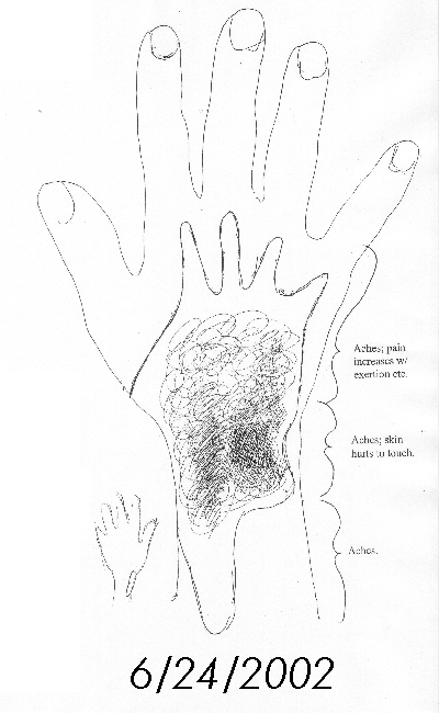
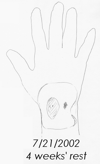
Here are the first 3 images, and what made the difference between them:
Baseline, after working as best I could with the injuries:
After about 4 weeks off duty, resting and recuperating:
After 1 single week back at work on restricted duty:
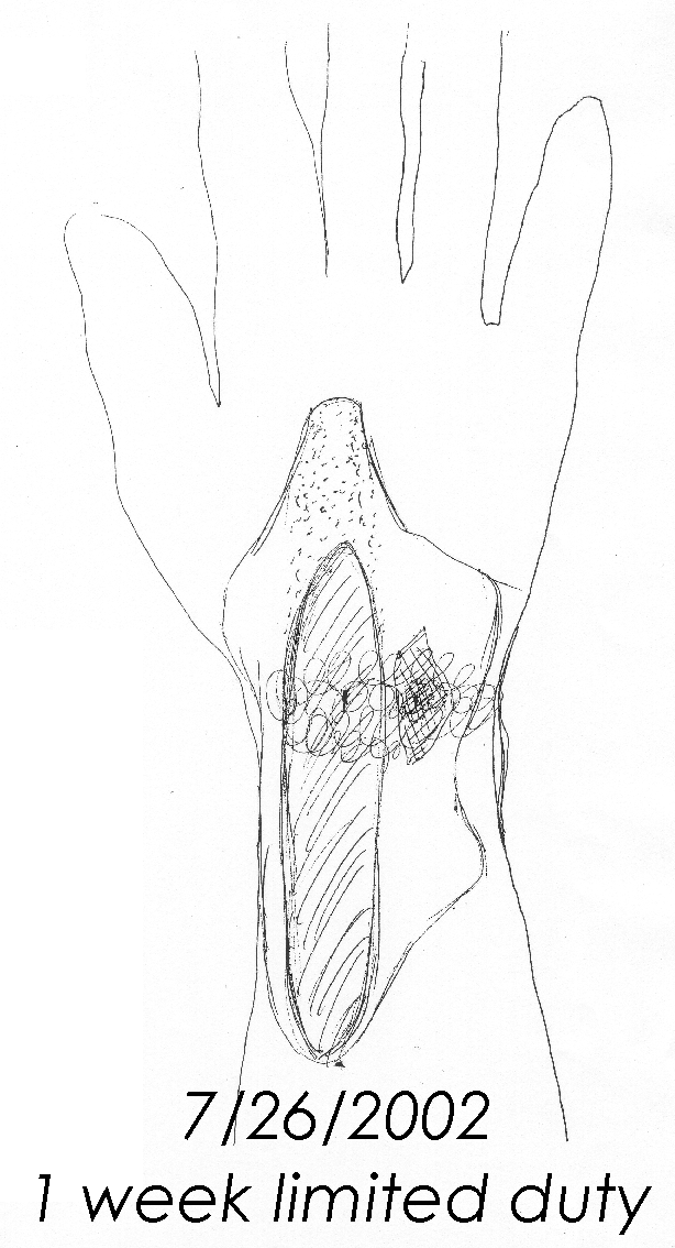
That doctor was right. They really do tell the whole story.
See how easy that was? 🙂 All it took was a pen, paper, and a few notes.
Here are some tips:
- Put the date and your name on every single one, always.
- Be consistent about how you label things. They don’t need to learn different labeling systems, they need to learn your case’s course over time.
- This is a good place to note your pain ratings.I annotated my snapshots with current pain range (at rest and on exertion), bullet points and narrative notes, but it took awhile to learn to keep those annotations very short and to the point.
I scanned all the snapshots into my hard drive, so I can recreate these at any time. I find it very useful when breaking in a new team, because the story told by my first few years of pictures really does tell the key parts of those first few years. They “hardly have to look at the medical record” to understand — and remember! — what happened.
Plus, you clearly don’t have to be an artist to make these pictures accurate and useful 🙂 If tracing around your own limb is too painful or awkward, there’s no reason not to ask someone else to do theirs. Alternatively, you could take a photograph and use image-editing software (available with your camera, or for free or cheap online) to mark the image with your signs and symptoms.
There are lots of ways to get these images going, with any set of tools. And boy, are they ever worth it.
As a point of interest, the freeware I use for editing images is called Gimp. Perfect tool-name for someone like me, eh?