Let’s leap right over the climate arguments and just say that wildfires and their fallout (literally, since the particles “fall out” of the clouds) are a big deal these days.
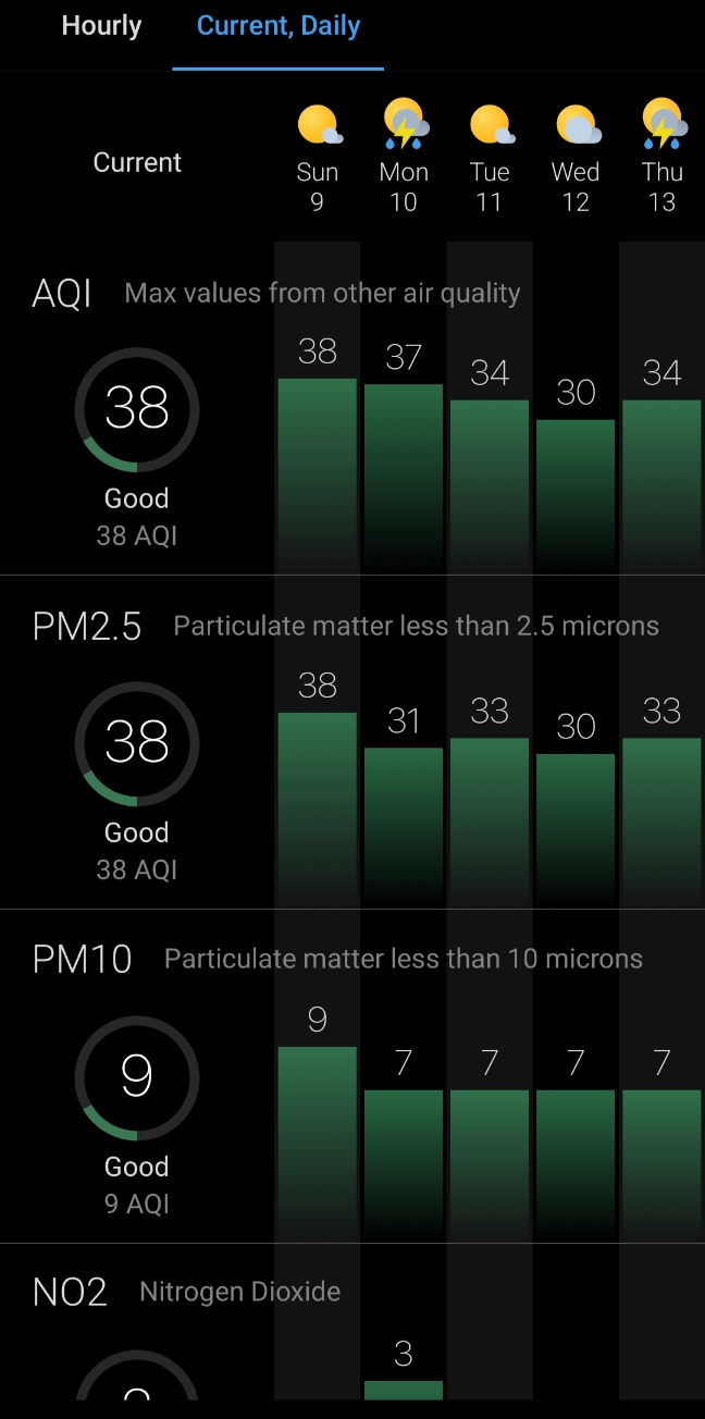
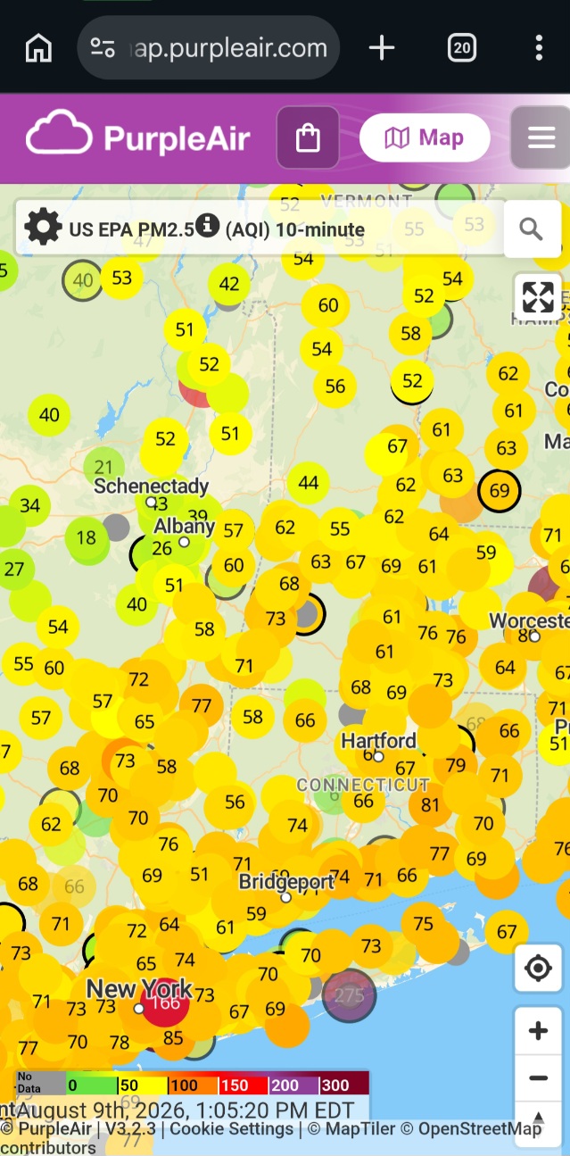
If, like me, you check your Air Quality Info (AQI) and it’s all green & good, but you look outside and the sky is all yellow and kinda gross, it’s time to delve a little deeper.
1. Consider the source
Keep in mind that — rightly or wrongly — the United States’ climate science programs have been gutted. We used to lead the world on this, so, it’s a really big loss of data and validity. (Validity is determined by how carefully the instruments are set and cared for, then how appropriately the numbers that come out of them are used, and then how well the results are put into the public realm. Validity requires staffing, training, and lots of equipment. …Oh well.)
Since I’ve learned how badly climate science (which includes air science) has been de-funded, I’ve been waiting for the federal air quality data to get worse. Let’s see if this has begun.
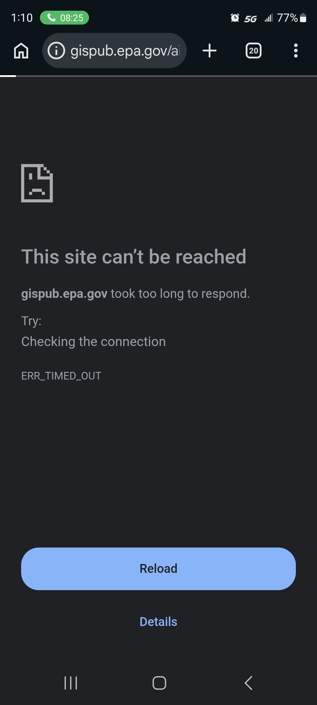
This is not the only source of info, though. My state uses the national data and packages it for the state. Same issue as the first picture, though:

That said, let’s look at non-governmental programs that collect air data from volunteers. Usually, volunteers buy their air-quality analyzing equipment out of their own pocket, set it up, and attach it to the larger network of that brand or program.
What could possibly go wrong?
Unlabeled data, for a start.
Some people need to track their indoor air quality with these well-made air aanalysis instruments… but can’t tag it in the system accordingly. This messes with the average air quality results, which are all pooled together, indoor air and outdoor air alike.
How do we know that?
Well, for instance, if you’ve got one Excellent reading of 6 next to another reading of 68 and Unhealthy, that’s a very good clue that one of those is reading indoor air:
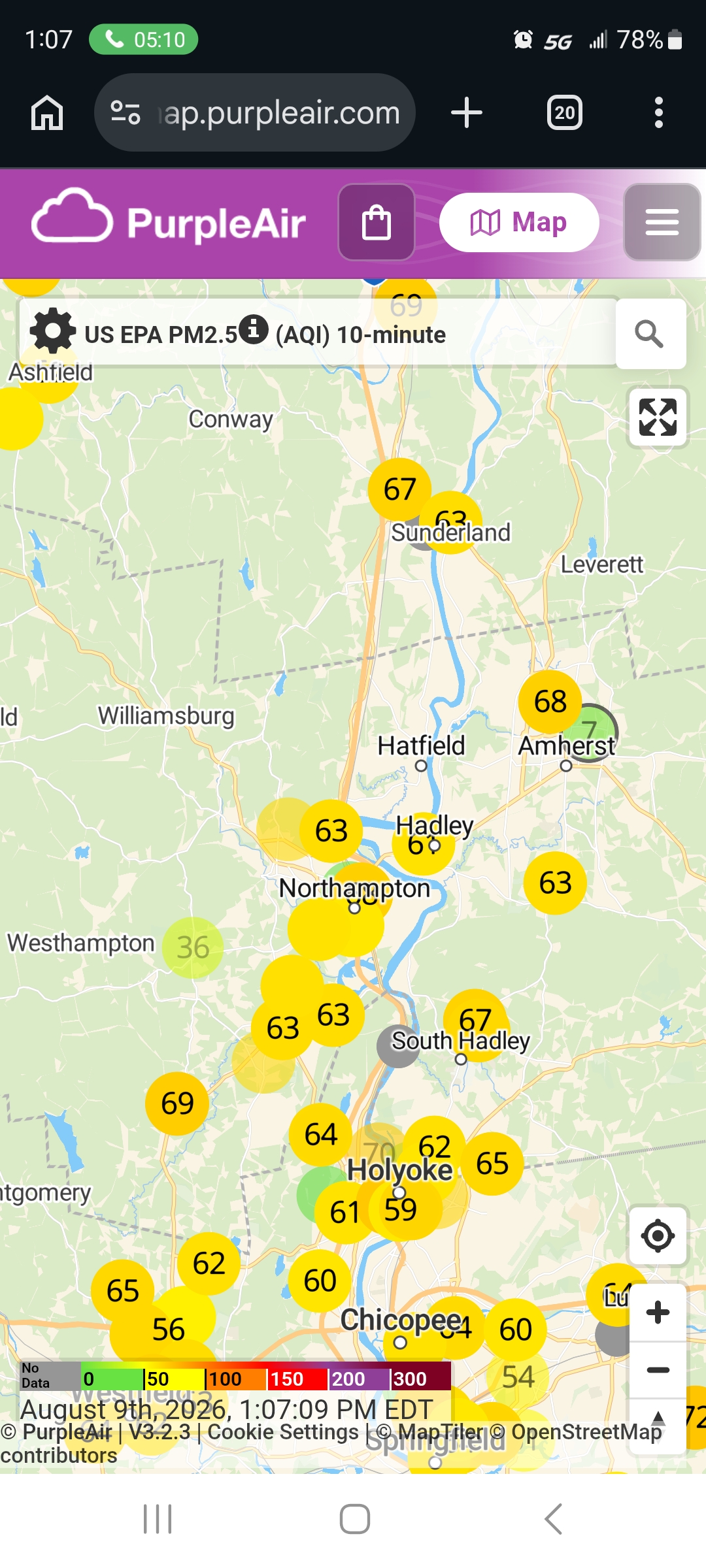
Also, people with sensitive/reactive systems may need to monitor indoor air pretty aggressively in high-pollution areas, where monitoring outdoor air is considered absurd:
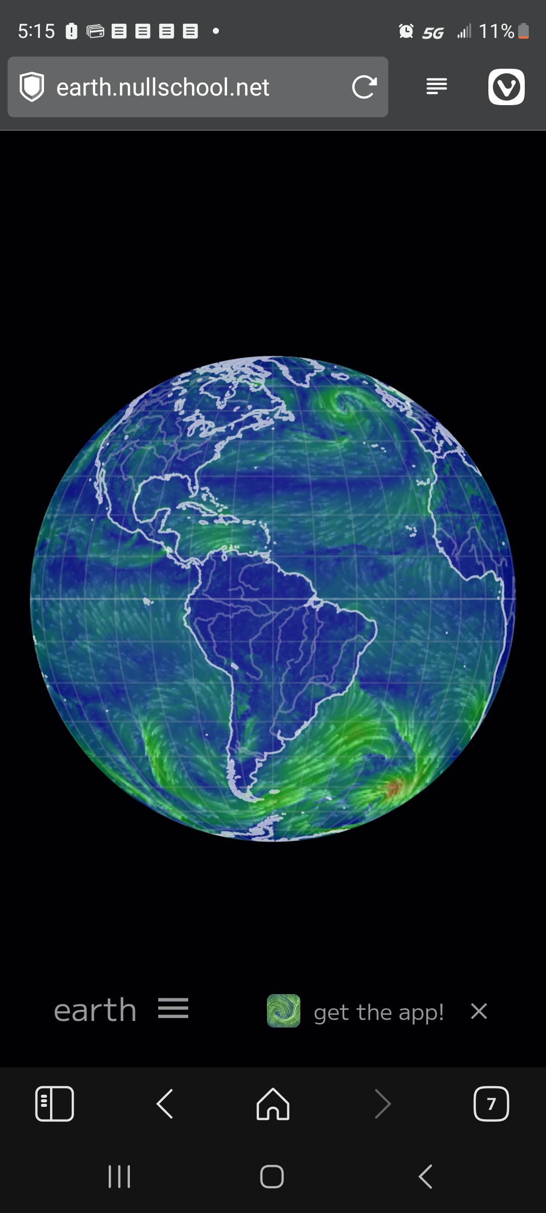
One resource I rely on for a sanity check is earth.nullschool.net, a gorgeous free online tool that shows the air, the oceans, and what they’re pushing around.
It’s such a great tool, we’ll look closer at it.
Earth
Here’s what it looks like, as of today:
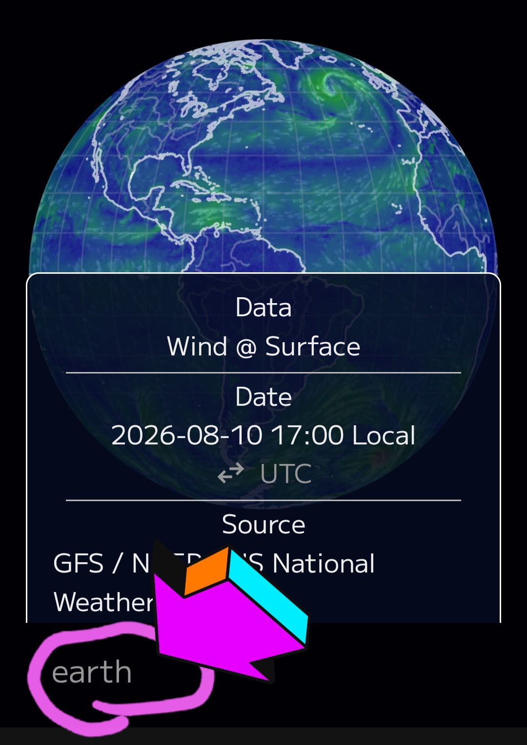
Touch the word “earth” to open or close the menu:
For our purposes, scroll down and adjust your settings to this:
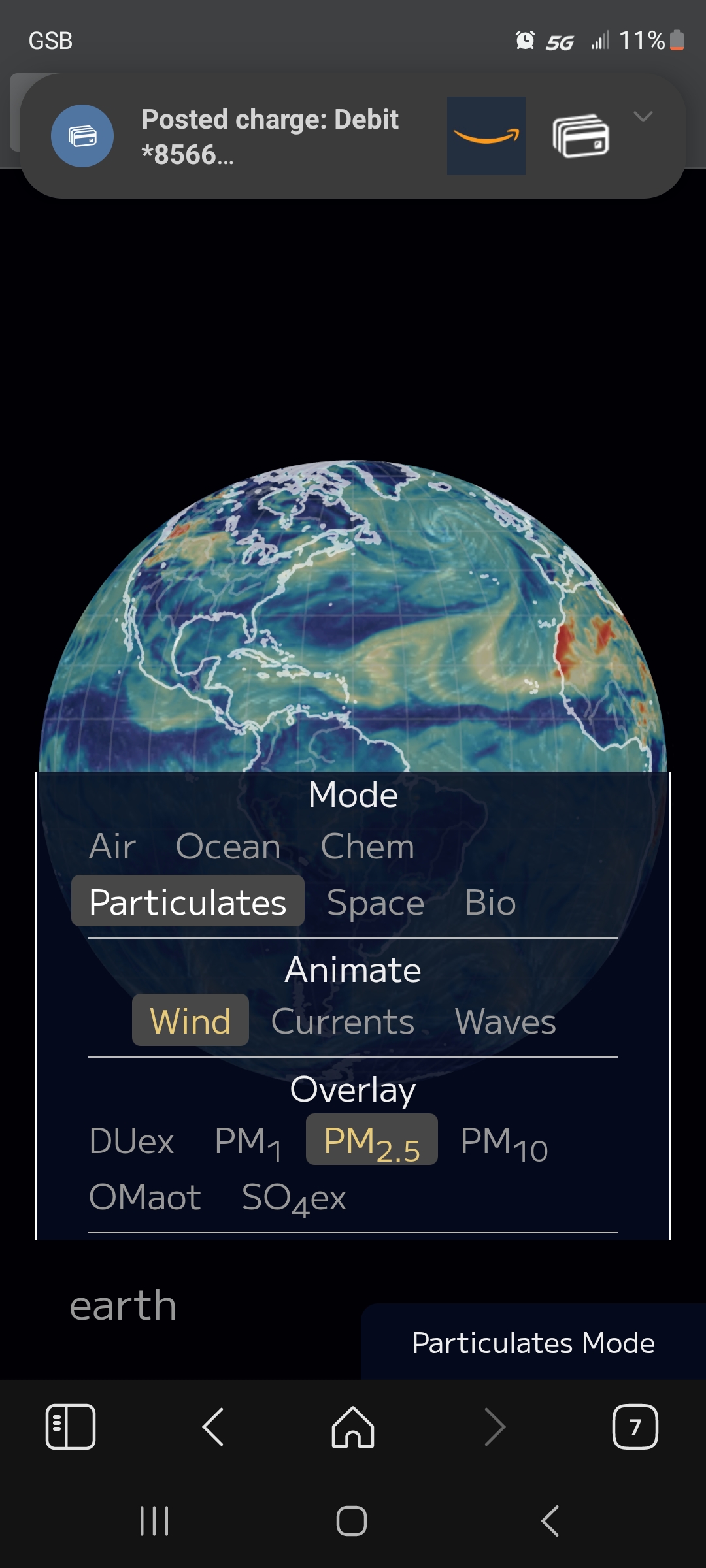
PM stands for Particulate Matter and 2.5 is widely considered the riskiest particle size. It’s generated by wildfires, building fires, and volcanic eruptions. That particle size, in excess, is a real problem for anything with heart or lungs.
You can look at where they get their readings: usually 3 or more sources.
Let’s take a look at Schenectady on this setting:
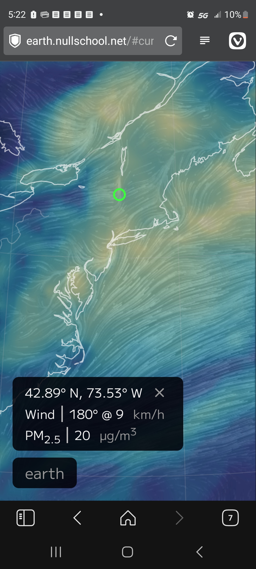
It’s the lowest end of that yellow smear, in the green circle.
That shade of yellow doesn’t correlate to an AQI under 30. If you go back and look at the Purple Air monitors for Schenectady, you’ll see what I mean about “the data don’t match the reality”.
Data don’t care if you like them. Facts don’t care if the data matches them. They are what they are.
If your health and function depend on knowing the reality, then it’s good to develop good tools to figure out what the reality is. I hope this helps.
In the end, my policy is simple: if the air looks wrong or smells bad, I want to mask up before going outside — and I bring my personal filter in case it gets worse!
And now… a little perspective
Skip this if you’re not up to it. It’s rough.
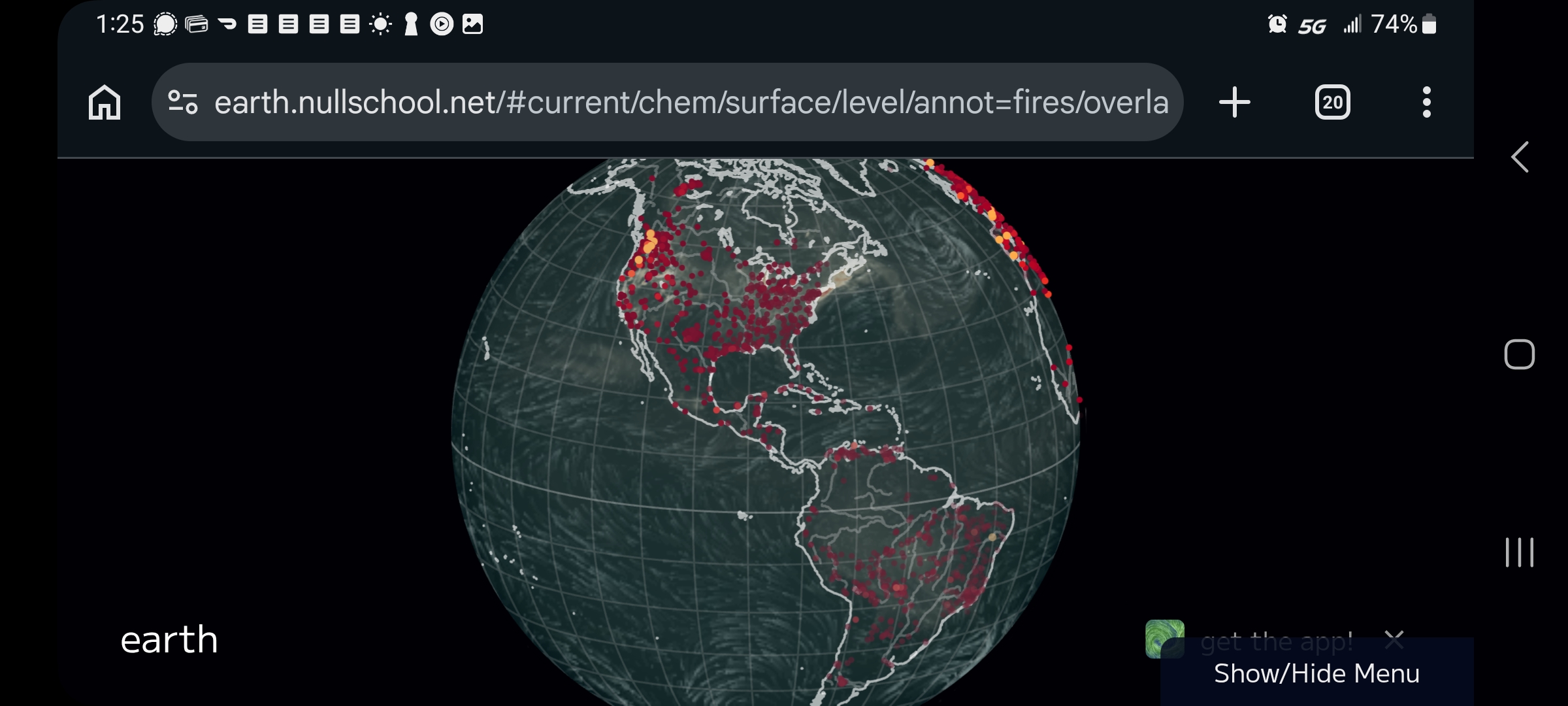
The American continents and their wildfires. South fewer wildfires than North — it’s winter down there.
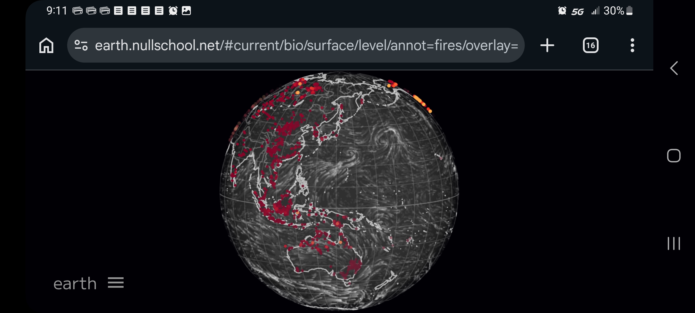
Most of Asia, Australia, and the western Pacific Rim
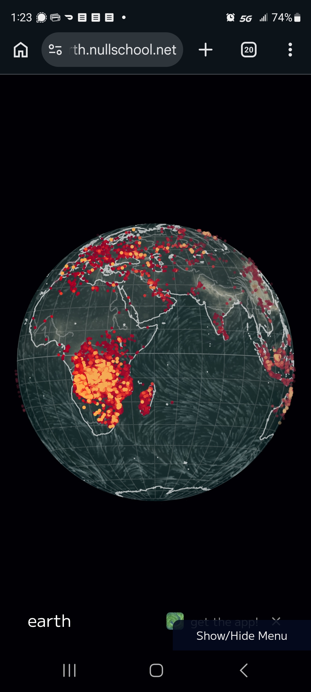
Europe is bad, as are the horrific war zones in Ukraine and the Middle East… but sub-Equatorial Africa is absolutely aflame, the worst of all.
And it’s winter down there. WTAH: